Location of Delay in NY
opt_delay = read_csv("./data/opt_delay.csv")%>%
  distinct(school_name,.keep_all = TRUE)
Count Data
There are a total of 1063 schools analyzed in this dataset with complete location data from 2015 and 2021.
Average Delayed Time
It is a table showing that how many schools are in each average delay time level in New York from 2015 to 2021.
avergae_delayed = data.frame(opt_delay %>% count(how_long_delayed))
avergae_delayed %>%
  rename(frequency = n) %>%
knitr::kable()| how_long_delayed | frequency |
|---|---|
| 0-15 Min | 155 |
| 16-30 Min | 261 |
| 31-45 Min | 270 |
| 46-60 Min | 247 |
| 61-90 Min | 130 |
Maps
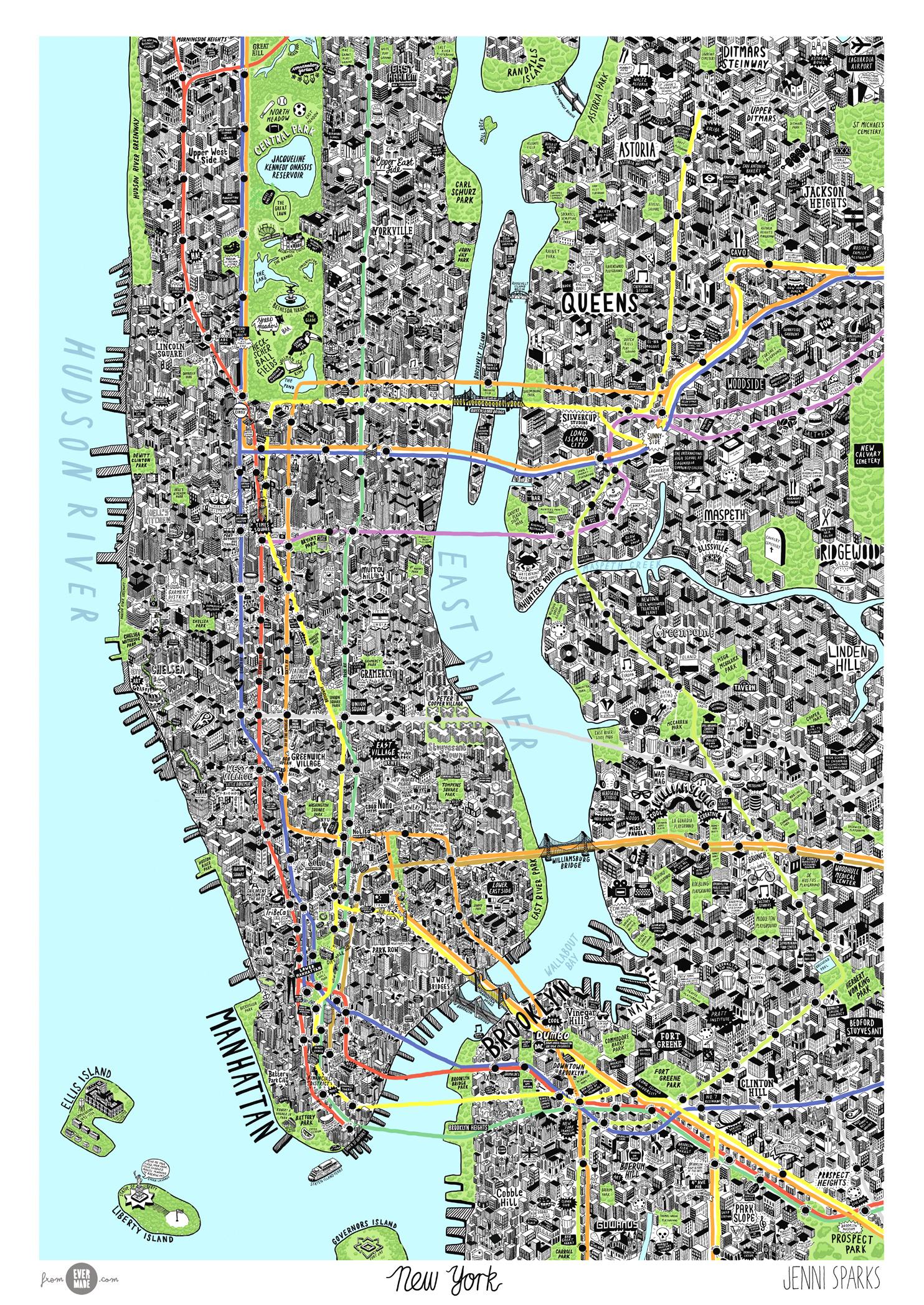
Manhattan Map Reference
For reference, here is a helpful map of the neighborhoods in New York
New York Map
These maps include data provided by New York City in the open source crash database and data.world, generated by Plotly Chart Studio and Mapbox geolocation software.
School Bus Delayed in New York
This map displays the geolocation of school buses delayed in New York City from 2015 to 2021.
The school buses in Manhattan averagely have a longer delayed time.
# plot
map_school =
  opt_delay %>%
  mutate(school_delay = str_c(school_name,",",how_long_delayed)) %>%
  plot_ly(
    lat = ~latitude,
    lon = ~longitude,
    color = ~how_long_delayed,
    colors = "Set1",
    marker = list(color = "dark"),
    type = 'scattermapbox',
    hovertext = ~school_delay,
    mode   = 'markers')

map_school =
  map_school %>%
  layout(
    mapbox = list(
      style = 'open-street-map',
      zoom =9,
      center = list(lon = -73.93, lat = 40.71)))


map_school
When We Focus on Manhanttan…
# plot
map_school_manhattan =
  opt_delay %>%
  filter(city == "Manhattan") %>%
  mutate(school_delay = str_c(school_name,",",how_long_delayed)) %>%
  plot_ly(
    lat = ~latitude,
    lon = ~longitude,
    color = ~how_long_delayed,
    colors = "Set1",
    marker = list(color = "dark"),
    type = 'scattermapbox',
    hovertext = ~school_delay,
    mode   = 'markers')

map_school_manhattan =
  map_school_manhattan %>%
  layout(
    mapbox = list(
      style = 'open-street-map',
      zoom =10,
      center = list(lon = -73.96, lat = 40.77)))

map_school_manhattan
Density Heatmaps
These maps include data provided by New York City in the open-source crash database and data.world, generated by Plotly Chart Studio and Mapbox geolocation software.
map_school_manhattan_density =
  opt_delay %>%
  filter(city == "Manhattan") %>%
  mutate(school_delay = str_c(school_name,",",how_long_delayed)) %>%
  plot_ly(
    lat = ~latitude,
    lon = ~longitude,
    color = ~how_long_delayed,
    marker = list(color = "dark"),
    type = 'densitymapbox',
    radius = 3)

map_school_manhattan_density =
  map_school_manhattan_density %>%
  layout(
    mapbox = list(
      style = 'open-street-map',
      zoom =8,
      center = list(lon = -73.96, lat = 40.77)),
    title = "Density Heatmap of School Buses delayed in Manhattan")

map_school_manhattan_density
Summary
Data in these geolocation and density heatmap plots help identify certain schools in New York City that appear to have more severe school bus delayed. They are around East Harlem and Lower East Side, as well as the Hudson Yards.